
Sol Coffee — Brand Identity
CATEGORY
Concept / Personal Project
YEAR
2020
As a Brazilian expat living in London, the pandemic has made it especially hard being away from family and friends. I wanted to do a tribute to my home country and that's how Sol was born.
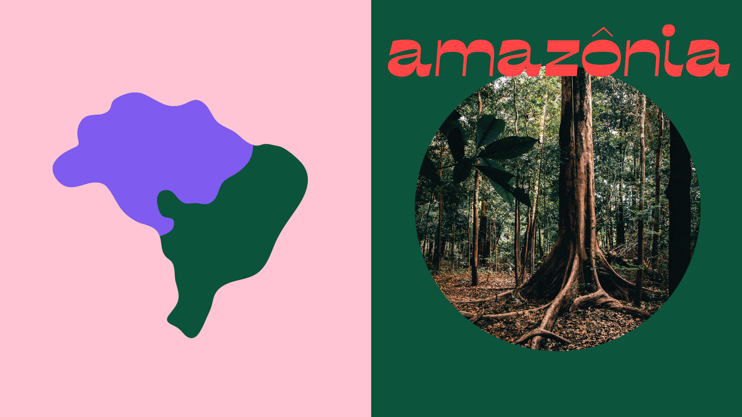
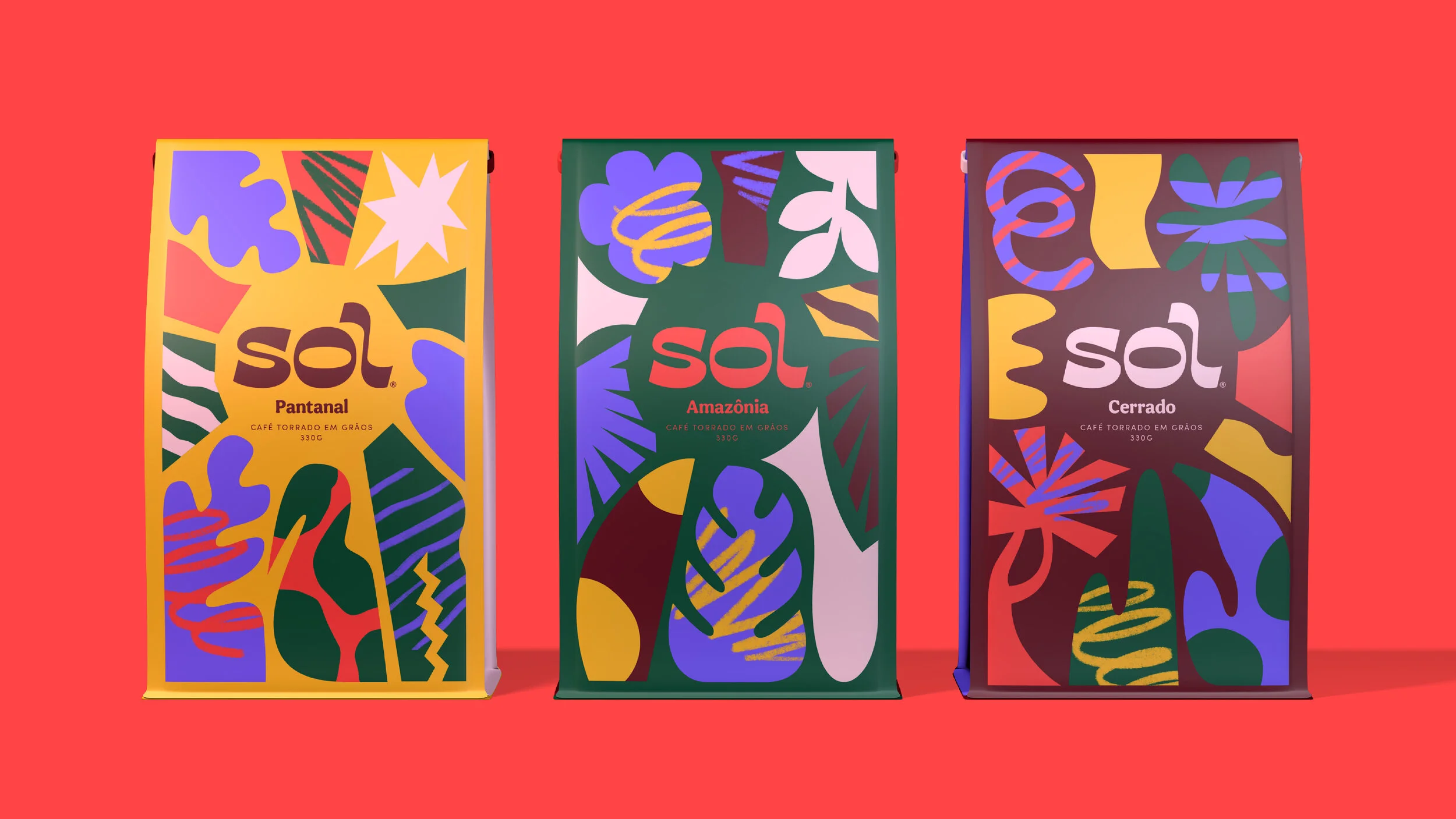
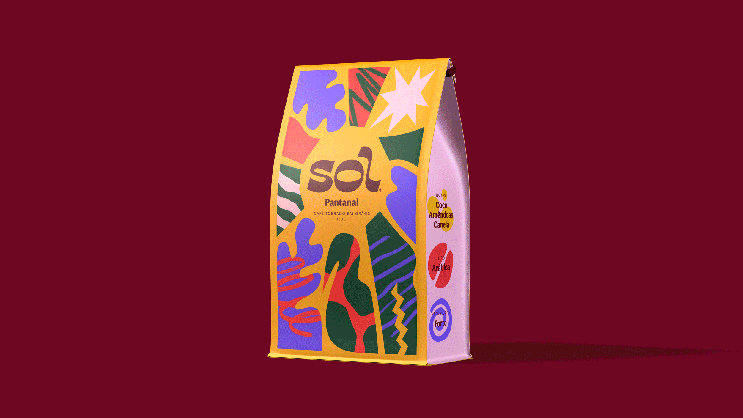
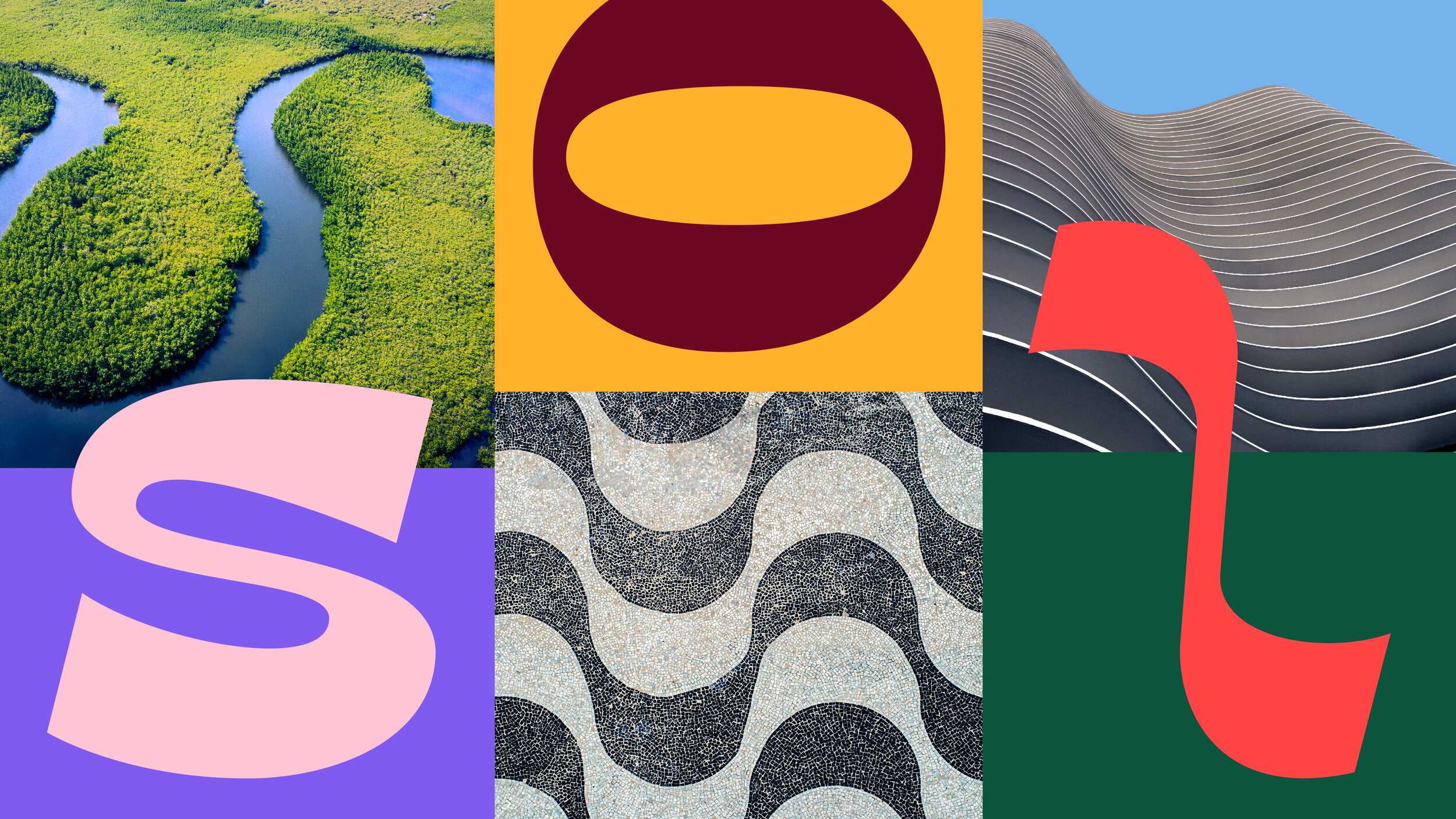
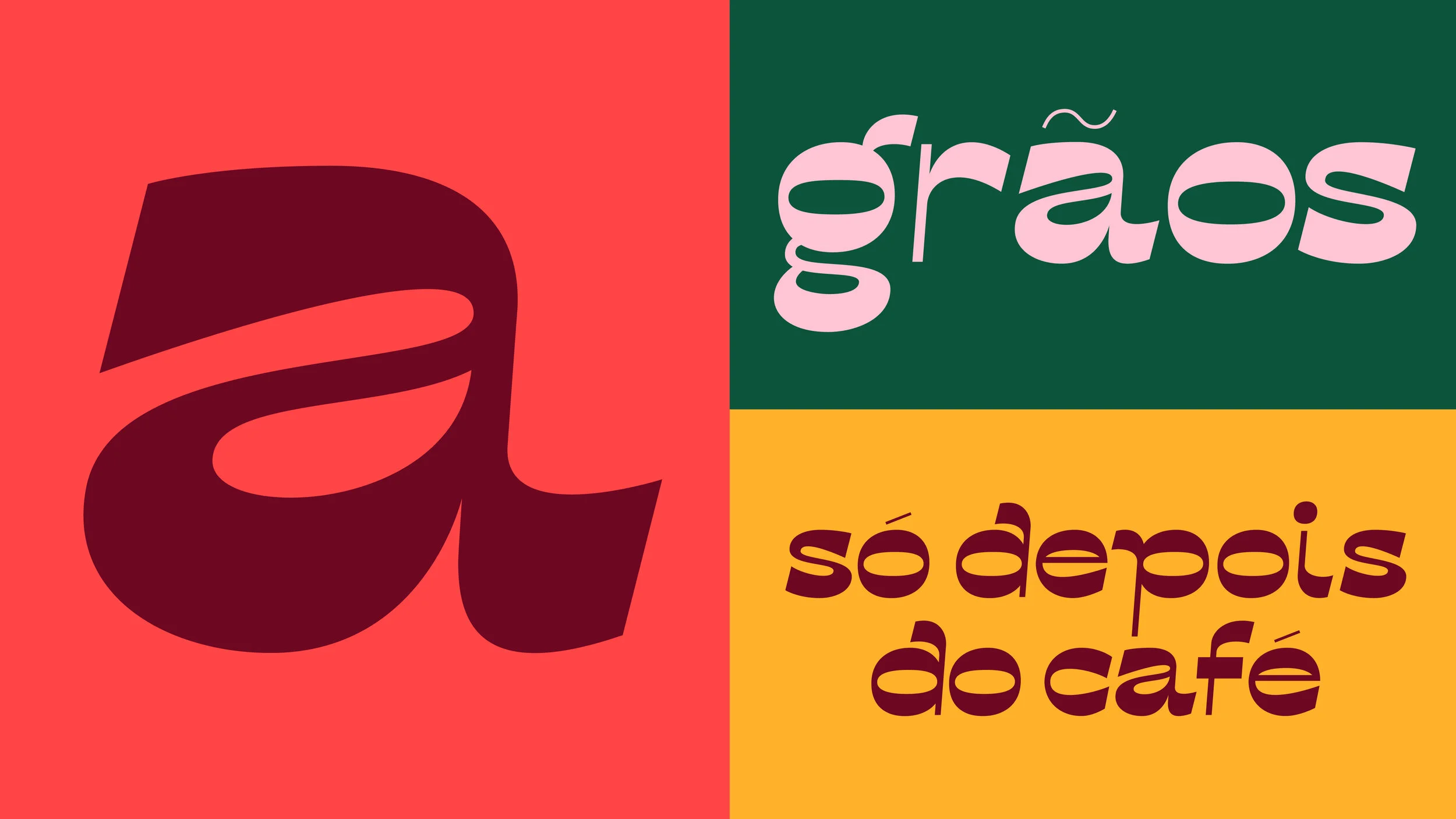
Sol, which translates to "sun”, is a concept coffee brand inspired by the diverse colours and flavours of Brazil. The wordmark takes inspiration from the sinuous shapes of its natural and urban landscapes, followed by a custom bold display typeface.
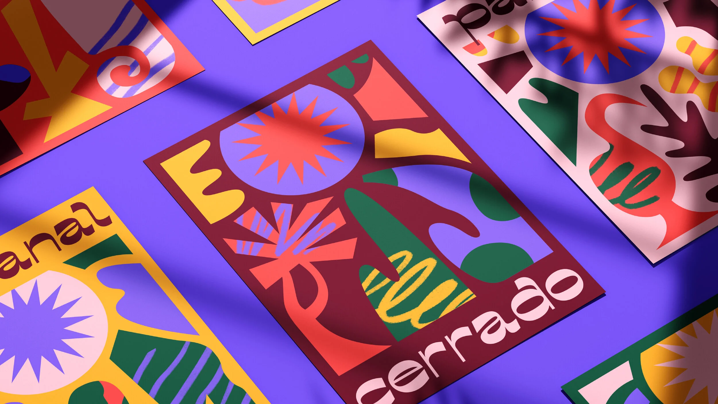
Sol’s flavours are inspired by the 6 regions of Brazil - Amazônia, Pantanal, Cerrado, Mata Atlântica, Caatinga & Pampa - and their native fauna, flora and ingredients. With an expanded colour palette that is a modern interpretation of the flag's green, yellow and blue, all elements come together on the packaging, keeping the wordmark centred as a source of life and growth.


Awards
DIELINE AWARDS
First Place, Concept Beverages
LATIN AMERICAN DESIGN AWARDS
Silver, Packaging
Featured on
The Dieline
The Dieline - Pack of the Month
Brand New
Print Mag
Abduzeedo
Packaging of the World
Best of Packaging
Design by Womxn
The Inspiration Grid
Credits
DESIGN & ILLUSTRATION
Lilia Quinaud
RESOURCES
Unsplash
Shutterstock
PixaBay
Adobe Fonts
Layers.Design
GraphicBurger
Creative Market
Mr. Mockup